Thursday, 8 December 2011
247. Student magazine analysis
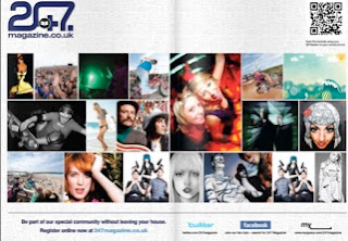
The magazine 247 show colours connoting with the central image and masthead, which are also used to highlight it better. The colour also connotes a sense of youth with the green and also freedom. The background is a graffiti wall, which reaches out to its target audience (students), also gives them a particular stereotype to be rebellious. The name ‘247’ gives the impression that the magazine covers everything, 247 meaning all day every week. They also use the same colours with the strapline making the magazine look more presentable. With headlines with eye catching titles like ‘Street style’ is the sort of language, which communicates better with students and also makes the magazine appear more interesting. For the contents page the layout and colour have been changed however the same font tile style has been kept the same. The contents page includes a large variety of images of festivals, skateboarding etc. Which again can reach out to any student interested in at least one of these things. Below, the strapline includes information on social networking sites, which would increases their advertisement more. However there is very little text used in the contents page, which could make the organisation a little confusing however the images define what will be inside the magazine. Lastly the background used is very simple and light, which outlines the text and images a lot better.
Subscribe to:
Post Comments (Atom)


No comments:
Post a Comment