Thursday, 15 December 2011
Friday, 9 December 2011
Media questionnaire results
Q1: Please chose one of the following titles for my magazine:
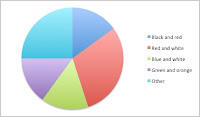
Q2: What main colours do you think are best for a college magazine?
Q3: What would you like to read about in this college magazine?
Q4: Do you think the language should be formal or informal?
Q5: What central image would be best for my magazine?
Q6: Do you think the layout of both pages be packed with images and text or fairly spaced out?
Q7: What sort of free gifts should be included in my magazine?
Q8: How much would you pay for a student magazine?
Q9: How often should my magazine be produced?
Q10: Lastly, should the magazine just be about College life, media stories or both?
Thursday, 8 December 2011
247. Student magazine analysis
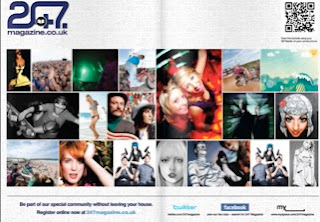
The magazine 247 show colours connoting with the central image and masthead, which are also used to highlight it better. The colour also connotes a sense of youth with the green and also freedom. The background is a graffiti wall, which reaches out to its target audience (students), also gives them a particular stereotype to be rebellious. The name ‘247’ gives the impression that the magazine covers everything, 247 meaning all day every week. They also use the same colours with the strapline making the magazine look more presentable. With headlines with eye catching titles like ‘Street style’ is the sort of language, which communicates better with students and also makes the magazine appear more interesting. For the contents page the layout and colour have been changed however the same font tile style has been kept the same. The contents page includes a large variety of images of festivals, skateboarding etc. Which again can reach out to any student interested in at least one of these things. Below, the strapline includes information on social networking sites, which would increases their advertisement more. However there is very little text used in the contents page, which could make the organisation a little confusing however the images define what will be inside the magazine. Lastly the background used is very simple and light, which outlines the text and images a lot better.
Second Student Magazine Analysis
The colours on this are mainly red and greens. These are stereotypical colours of Christmas to show it’s the December edition. Also by the use of a red ribbon going across the page which indicates "presents" for Christmas. The masthead of the magazine "Student ID" uses the same font and style to make the reader understands its brand identity. The heading is made out to be a stamp, which is normally red to indicate crime that makes this magazine more exciting.
The images seem to suit the magazine colours and layout, for example the girls red hair in the photo. The images shown are of different events to show how much this magazine has to offer. The images also appeal to the audience more as they look exciting or interesting. Lastly the use of text is kept low, as it is appealing to a younger audience, which isn’t always interested in reading. The magazine is designed to allow students to escape from college and other problems and just relax and not worry about it.
Thursday, 1 December 2011
Magazine Analysis
The popular rock magazine Kerrang, appeals to a similar sort of audience to a student magazine. Analysing this title page will help me understand what catches the teenage eye with the use of colour, image, layout, font etc. The masthead, which is usually placed at the top, indicates what brand and can also show what theme/identity the magazine is all about. In this case, the word Kerrang is spelt with an exclamation mark connoting it’s loud, also shown by the way the typography is split up.
The central image contrasts with the masthead to make it work. The image of the band instantly refers to there being a main story, which is use of synergy to promote each other. Their appearance and body language, shows the bands genre of music to be rock/alternative rock, indicated by the long hair and a typical band stance. The image attracts the audience because the lead singer of the band Biffy Clyro is recognisable. The uses of coverlines/links are in a range of different fonts, which are increased in size for a particular word, which catches the eye. Words like ‘Free’ and ‘Plus’ alerts the reader that there’s more included in the magazine, also known as puffs.
Items that the magazine doesn’t like to highlight, such as the price (unless it’s been advertised as cheaper), edition and barcode are usually at a much smaller font/size, and reasons are because they don’t want to fill too much space or don’t want the reader to instantly recognise. The use of language appeals to the target audience, they haven’t included a large amount. The text is mainly built up of band names, which is to reach out to as many people as possible, a teenager noticing a particular band they like will be tempted to read more about them.
Finally the use of colour is important in this magazine. The main colours used are black and white where the images and text go together. However the use of red as well is to outline the puffs, which are the free items included and other band stories. The colours connotate the rock theme, which is what Kerrang, is trying to give.
Preliminary exercise and action plan
I will be using DTp as well as an image manipulation program, I will be creating the front and contents page of a student magazine. The front cover is going to include photography of a student in a mid close-up surrounded by appropriate text which may suit the magazine.
My action plan:
Week 2 I will be researching the target audience and previous magazines which appeal to the age (also include questionnaire).
Week 3 I will produce a mock up for the two pages and preparation for the design (taking pictures and design brief).
Week 4 Will be designing and completing both pages.
Week 5 Will be working on evaluation questions
Final week will be completing and finishing the evaluation.
Deadline for Friday 6th January.
Introduction to Student Magazine
For my AS Media coursework the requirements are to create a new student magazine which includes a front page and a contents page. I will need to research magazines which appeal to the target audience; in this case teenagers. I need to identify what makes a good magazine, and also how the use of colour, font, layout etc. Makes a magazine successful.
Subscribe to:
Comments (Atom)


