Here are some of my possible music magazine titles:
1. OCDC
2. Cowboys and Indi
3. Rolling Stoned
4. Heavy Indi Vibe Positive
5. Wham! Frank
Friday, 3 February 2012
Thursday, 2 February 2012

Initial Idea for Music Magazine
The style and genre of my music magazine is going to be ranging from mainly rock from different generations however including metal. The audience I am targeting are from the ages of 16 - 23 which are the average age to appreciate this music. I have researched magazines like Metal Hammer and Kerrang! which also focus on that particular genre of music.
Analysis of Music Magazine - Double Page Article

This double page spread from Kerrang! is about a rebellious 17 year old artist as shown on the page. The style of language is quite formal however uses words like ‘wild’ and ‘outrageous’ to express this artists personality. Again the house style is kept the same however the use of red the meaning of danger or evil. The other font styles give a very strong meaning, especially in the title, adds to the effect of danger. The use of mise-en-scene in the central image is effective from the use of clothing/make up. The clothes are leather which adds to the rebellious side, however also makes it seem quite sexual. The stance of the girl gives the impression of her not caring which would appeal to other audiences her age. The ratio between the text and image is almost even however more of the image is shown which is what till get the most attention at first glance.

This other double page is from the magazine Kerrang! that features the band My Chemical Romance (MCR). The use of colour again is similar to the previous double page as the use of red connotes the house style, as well as resembling the band to be another rebellious group, which could represent danger or being bad. The layout is mainly taken up by the use of images, as that is what interests the reader more and would make the article seem far more interesting at first glance. The use of photos is again to connote with the house style and also helps with the representation. The use of language is quite informal as it is appealing to the target audience, which is of a younger age. Further more the style of font is kept quite bold and fairly easy to read, which is so the reader at first glance can recognise what the magazine is about and whom it’s about. Finally the other headlines on the same subject are there to influence the reader more to buy it, words like “exclusive” and “New MCR track” would interest them and give them the impression that there getting more than they paid for.
Analysis of Music Magazine - Contents Pages

This contents page from NME magazine uses the brand identity the same, by keeping the same brand style and its colours similar and not too overpowering. For the headlines on this page, it uses quotes from certain band members which would make the reader want to purchase the magazine.
NME also use advertisement which would interest their target audience. Also from the use of their layout they show the contents of what’s inside to try and offer a taster of as much of the magazine as possible. Furthermore the contents uses more than one image, this is to expand and share more information with the target audience. As well as the use of mise-en-scene, the props like the bass guitar for example would interest a small proportion who perhaps plays the instrument. The use of font is kept quite simple, which helps the reader understand the context a lot better if they were scanning through the magazine. Finally the layout is a huge importance for a contents page which helps the reader find their way around, NME have also made the different parts of the magazine colour coded on the right hand side, which helps the reader for what specifically they are looking for.
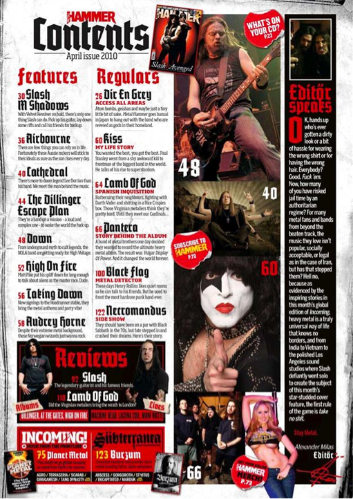
The Metal Hammer contents page uses its brand identity which helps with the layout and placement of images and text. The images are marked with the page numbers which helps the reader find out more of the image if they were interested. The images use mise-en-scene quite well as they appeal to the audience with the clothes and props. Also from the positioning gives the band members a sense of power making people feel inspired and want to be like them. The magazine also offers adverts which would appeal to its audience, such as albums, DVD’s etc. The layout is designed to be quite packed; reasons are to show the magazine has a lot to offer and well worth the money. If the reader got the impression the magazine was packed they would be more likely to buy it.
The use of puffs connote with the contents page, by the use of the stickers to promote the magazine gives it a more rebellious look, and helps keep with the brand identity. Finally the use of language is kept quite formal and more neatly paragraphed, however the list of band names are kept at a large font, which is what will grab the reader’s attention.
Friday, 27 January 2012
Analysis of Music Magazine - Front Covers

The magazine appeals to their particular audience. The house style helps a buyer recognise the magazine from the strong bold font where the other text connotes with the masthead. The modal address helps with getting the audiences attention. With the use of language like “In the studio and about to go global” doesn’t bore the reader, makes them keen to read on and also communicates to the reader in the informal language they prefer. Again, the bold words from the banners stating “NME Exclusive” helping the magazine sell more and giving the impression that it has more included than normal.
The use of puffs and cover lines scattered around mentions other news and stories that again would appeal from the use of modal address. The centre image uses dominant ideology that gives the impression of a rebellious character shown from the tattoos. Finally the layout is designed to hide the information, which isn’t necessary such as the barcode and the price and enlarge the information, which is most likely to convince the reader to buy it. Also the layout of the cover lines fills the negative space or background, which is to make it seem packed with, stories, news etc. And well worth the price.

The use of language is very short in words, as the audience are of the younger age, as the stereotype of a younger person would state they are not interested in reading a lot. Lastly the use of font varies from bold and clear to more unique and more suited to the house style. Which is part of the modal address to help the magazine sell.

Future Publishing produces guitarist magazine, which is a specialist magazine for people who are interested in or play guitar. The masthead is kept simple, however clear which is to help people recognise the genre of the magazine, this goes with the centre image which is a brightly coloured guitar also used to try and catch the readers attention.
This magazine also uses a house style for this particular issue, which are orange, white and grey. This is so the text and image both connote the magazine to make the layout flow. The use of language is quite formal as ages of this niche audience vary, again the use of cover lines highlight the main words which would jump out to the audience, such as the word “Fender” which people know it’s a popular guitar make. This magazine also includes a lot of advertisement and competitions where the prizes would most likely be items to do with guitar. The magazine also mentions reviewed guitars and interviews with famous guitarists such as Joe Satriani, which would interest almost any guitar player.
Friday, 6 January 2012


Subscribe to:
Posts (Atom)