Thursday, 29 March 2012
Monday, 19 March 2012
Evaluation Question 1:
In what ways does your media product use, develop or challenge forms and conventions of real media products?
My front page includes several features of a music magazine, such as mastheads, central images, cover-lines etc. This normally is what the layout of my music magazine includes. Central images for my front page is to get the readers attention, which i used bright colours to highlight the image of the people posing as guitarists, this would help my audience understand the genre and style of my magazine.
My contents uses conventions of a real music magazine, such as pages listed and included, along with the form of advertisement. I also tried to keep the colour scheme in correlation with the rest of the pages, such as from magazines like Kerrang!, they stick with a particular colour code and layout style.
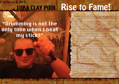
My double page spread I have kept fairly similar to a typical music magazine article, which consists of one main image and the article of about 500 words. For the font styles, I use san serif text for the article as it is only for reading and not catching the readers attention. However for the larger more exciting fonts for the masthead and other areas I use to capture the genre of music and the attention of the reader.
I have included some things which aren't usually enlisted on a typical magazine, such as banner being carried on throughout all the pages and finally I used a more creative background for my central image on my front page instead of a plain white background.
Thursday, 15 March 2012
Friday, 9 March 2012
Stages of creating my double page
The process was the same thing for my double page spread which I added text and the article later on InDesign.
Thursday, 8 March 2012
Stages of creating my contents page
Again like the front page I created the masthead and other parts to my magazine in photoshop.
I then imported the page into InDesign to add the text and finish the layout.
I then imported the page into InDesign to add the text and finish the layout.
Wednesday, 7 March 2012
Stages of Making my front page
To make my front page, I created the masthead and banners in photoshop. Which Involved using textures from my graphics work into getting the colour I wanted.
I changed the colour/brightness using the Hue/saturation tool.
I then imported the image into InDesign which is where I added the text.
Graphic images I will be using for front page
I will be using some digital manipulated images from my graphics work which I thought would be well suited to my media coursework.
Subscribe to:
Comments (Atom)


